This document is Copyright © 2021 by the LibreOffice Documentation Team. Contributors are listed below. You may distribute it and/or modify it under the terms of either the GNU General Public License (https://www.gnu.org/licenses/gpl.html), version 3 or later, or the Creative Commons Attribution License (https://creativecommons.org/licenses/by/4.0/), version 4.0 or later.
All trademarks within this guide belong to their legitimate owners.
To this edition
To previous editions
Jean Hollis Weber
Please direct any comments or suggestions about this document to the Documentation Team’s mailing list: documentation@global.libreoffice.org.
Everything you send to a mailing list, including your email address and any other personal information that is written in the message, is publicly archived and cannot be deleted.
Published December 2021. Based on LibreOffice 7.2 Community.
Other versions of LibreOffice may differ in appearance and functionality.
Forms are used when direct entry into a table is inconvenient, to pick up errors in data entry promptly, or when too many tables make direct management of data impossible.
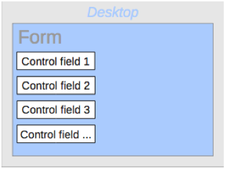
A form in Base is a structure invisible to the user. It serves within Base to allow contact with the database. What is visible to the user is the set of controls, which serve for the entry or display of text, numbers, etc. These controls are divided by the GUI into various types.
The term Form has two meanings. It can stand for the whole content of the input window which is used to manage data for one or more tables. Such a window can hold one or more main forms, and each of these can contain subforms. The word Form is also used for these partial areas. It should be clear from the context which meaning is intended so that misunderstandings should be avoided.
The simplest way to create a form is to use the Form Wizard. Use of it to create a form is described in Chapter 8, Getting Started with Base , in the Getting Started Guide . That chapter also explains how you can further modify the form after using the Wizard.
This guide describes the creation of a form without using the Wizard. It also describes the properties of the various types of controls in a form.
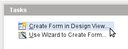
We start by using the task Create Form in Design View in the Forms area of the main Base window.
This calls up the Form Editor and the form is shown in the Design View window (Figure 1).
The Form Controls toolbar is docked on the left side. The Form Design toolbar (Figure 2) is docked at the bottom. If these toolbars do not appear automatically, use View > Toolbars to display them. Without these toolbars, it is not possible to create a form.
Figure 1: Form shown in Design View
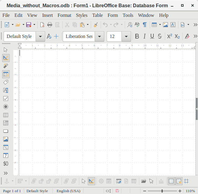
The blank area shows a grid of dots. This grid helps you to position the controls accurately, especially in relation to each other. The symbols at the right end of the Form Design toolbar show that the grid is visible and active. The last three symbols should be visible and active. If not all are, click the ones that are not.
A form is created on the empty page. This can be done in two ways:
To display the Form Navigator, click the Form Navigator button (shown in Figure 3). A window appears (Figure 2); it shows only one folder, labeled Forms. This is the highest level of the area that we are editing. Several forms can be accommodated here.
Figure 2: Using the Form Navigator to create a new form
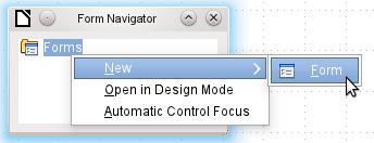
Figure 3: Form Design toolbar

In the Form Navigator (Figure 2), right-click on Forms to open a context menu. Choose New > Form to create a new form. The other choices in the context menu (Open in Design Mode and Automatic Control Focus) correspond to buttons in Figure 4; we will discuss them later.
To launch a form with the cursor in the first field, use the option Automatic control focus . What counts as the first element is determined by the form’s activation sequence.
Unfortunately there is currently a bug (Bug 87290) in this function. If a form contains a table control, the focus is set automatically to the first field in this control. Oddly enough, this bug is cured if, after choosing automatic control focus, you change the user interface language.
The form carries the default name Form . You can change this name immediately or later. It has no significance unless you need to access some part of the form using macros. The only thing you need to ensure is that two elements with the same name do not occur on the same level in the folder tree.
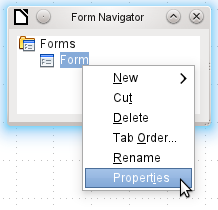
The context menu of the form (shown below) provides the way to create form properties.
The Form Controls toolbar (Figure 4) contain the buttons with which the controls (label plus field) can be created. Not all of the buttons are directly visible along the left side of the form. Click the bottom button (») to see the rest of the visible buttons. To see all of the buttons both visible or not, right-click any part of the toolbar and select Visible Buttons . The visible buttons are checked; the unchecked ones are not.
This permits selecting the buttons that the user wants to use regularly while removing the undesirables. As an example, the Table Control button is not visible, but can be made so by first locating it in the list of all of the button and then checking it.
Figure 4: Form Controls

When you select a form control, you automatically create a form. For example, suppose you choose a text field: the cursor changes shape and a rectangular shape may be drawn on the white surface of the form. Then, on the stippled surface of the form, a text field appears.
Now you can create the form by right-clicking and using the context menu for the control (Figure 5).
Figure 5: Context menu for form
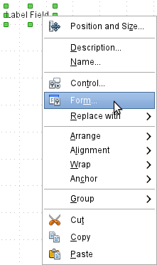
Select the Form menu option (highlighted in the illustration) to set properties for the form you have just created. The form has the default name Form.
As well as forms that are created within Base, there is also a possibility to create forms in Writer or Calc. These are described in Chapter 7, Linking to Databases.
When the form properties are called up using the context menu in the Form Navigator or the context menu of a form control, a Form Properties window appears. It has three tabs: General , Data and Events .
Here you can change the Name of the form. In addition there are design possibilities that have no significance inside Base. They show only the more general possibilities for design using a form editor: when you create a Web form you will need to use them.
URL: Destination for the data.
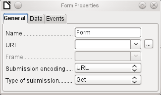
Frame : Section of the destination website to be addressed where necessary.
Submission encoding : in addition to the normal character encoding for transmission to the URL, you can specify here text encoding and multipart coding (for example, for transfer of data).
Type of submission : GET (visible via the URL attached to the filename; you can see this often in the web if you use a search engine) or POST (not visible; suitable for large data volumes).
For creating internal forms in Base, this is the most important tab. Here you can set the following initial properties for the form:
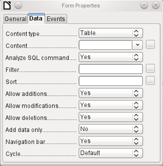
Content type : Choose between Table, Query, and SQL command. While Table can always be used for data entry into a form, this is not always the case for Query (for more information, see Chapter 5, Queries) or direct entry of a SQL command. Here we are dealing with a query that is not visible in Base's query container but has in principle the same structure.
Content : According to whether Table or Query was chosen above, all available tables and queries are listed. If a SQL command is to be created, you can invoke the Query Editor by using the ellipsis (…) to the right of the Content field.
Analyze SQL command : If the analysis of SQL commands should not be permitted (because, for example, you are using code that the GUI cannot show correctly), you should choose No here. However this will prevent the form accessing the underlying data using a filter or a sort.
Filter : Here you can set a filter. To get help with this, click the button to the right of the field. See also Chapter 3, Tables.
Sort : Here you can set up a Sort for your data. To get help, click the button to the right of the field. See also Chapter 3, Tables.
Allow additions : Should the entry of new data be allowed? By default this is set to Yes .
Allow modifications : Should editing of the data be allowed? By default also Yes .
Allow deletions : The deletion of data is also allowed by default.
Add data only : If you choose this option and enter No for the other selections, an empty form will always be displayed. There will be no access to existing data, which can neither be edited nor viewed. However, If Allow additions and add data only are selected, data can be added to a field. But once the data has been saved, it is no longer visible and the data has been written to the tables.
This property can be useful when there is data is to be added to the database but the person doing it is not allowed to only enter it but not to modify it in any way. Modification is to be left for another person to do with a different form which allows doing this.
Navigation bar : The appearance of the Navigation Bar at the bottom of the screen can be switched on or off. There is also a possibility, when you have a subform, always to show the Navigation Bar for the main form, so that activation of this toolbar affects the main form only. This setting for the Navigation Bar is not relevant to the internal navigation toolbar that can be added as a form control if required.
Cycle : The Default option for Base databases is that after entry into the last field in a form, the Tab key takes you to the first field of the next record – that is, a new record will be created. For databases, this has the same effect as All records . By contrast, if you choose Active record , the cursor will move only within the record; when it reaches the last field, it will jump back to the first field in that record. Current page refers particularly to HTML Forms. The cursor jumps from the end of a form to the next form on that page further down.
Events can trigger macros. A click on the button on the right (…) allows macros to be linked to the event.
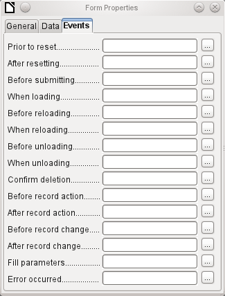
Reset : The form is emptied of all new entries that have not yet been saved.
Before submitting : Before the form data are sent. This is only meaningful for Web forms.
When loading : Only when opening the form, not when loading a new record into the form.
Reloading : This takes place when the content of the form is refreshed, for example by using a button on the Navigation Bar.
Unloading : This option seems not to function. It would be expected to refer to the closing of the form.
Record action : This includes, for example, storage using a button. In tests, this action regularly duplicates itself; macros run twice in succession.
This is because here different functions (“implementations“) are being carried out. Both have names: org.openoffice.comp.svx.FormController and com.sun.star.comp.forms.ODatabaseForm . If inside the macro that uses oForm.ImplementationName , the corresponding name is queried, the macro can be limited to one run.
Record change : The opening of a form counts as a record change. Whenever one record changes to another within the form, this action likewise occurs twice. Macros are therefore run twice in succession. Here too we can distinguish between the causes of this result.
Fill parameters : This macro will be run if a parameter query is to be invoked in a subform, but for some reason the parameter is not correctly transmitted from the main form. If this event is not caught, a parameter query will follow the loading of the form.
Error occurred : This event could not be reconstructed.
Once a form has been created, it can be filled with visible controls. Some controls allow the content of the database to be displayed or data to be entered into the database. Other controls are used exclusively for navigation, for searching, and for carrying out commands (interaction). Some controls serve for additional graphical reworking of the form.
Numeric entry, preformated for currency
Display and entry with additional formatting, for example using measurement units
Choosing between several different possibilities, also for transfer into the database of values other than those displayed
Similar to a list field, but with only the displayed value transferred, or you can enter new values by hand
Radio button; allows you to choose from a small number of possibilities
Display of images from a database and entry of images into a database via a path selection
Entry into a preset mask; limits the entry possibilities to specific character combinations
Universal entry module, which can display a whole table.
Integrated into this control are many of the above controls
Heading for the form, description of other controls
A frame around, for example, a set of option buttons
Button with label
Like a button, but with an additional image (graphic) displayed on it
Toolbar very similar to the one at the bottom edge of the screen
For selecting files, for example to upload in an HTML form—not further described
Can only be used with a macro—not further described
Can only be used with a macro—not further described
Here a value can be stored using macros and then read out again,
As with forms, control properties are grouped into three categories: General , Data , and Events . General comprises everything that is visible to the user. The Data category specifies the binding to a field in the database. The Events category controls actions, which can be bound to some macro. In a database without macros, this category plays no role.
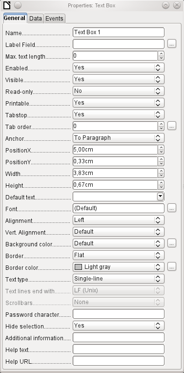

The name of a control must be unique within the form—used to access using macros.
[Name]

Does the field have a label? This groups field and label together.
A label allows the form field to be reached directly with a keyboard shortcut.
[LabelControl]

Non-enabled fields cannot be used and are grayed out. Useful to control using macros. (Example: If Field 1 contains a value, Field 2 must not contain one; Field 2 is deactivated.)
[Enabled]

Usually Yes; invisible fields can be used as intermediate storage, for example in creating combination fields with macros. See Chapter 9, Macros.
[EnableVisible]

Yes will exclude any modification of the value. This is useful, for example, for an automatically generated primary key.
[ReadOnly]

Sometimes it is useful to print a page from a form rather than a separate report. In this case, not all fields may be required to appear.
[Printable]

Within a form, the Tab key is normally used for navigation.
A field that is read-only does not need a tab stop; it can be skipped.
[Tabstop]

Does the field have a tab stop? Here the activation sequence within the form is specified.
[Tabindex]

Anchoring of graphics within a text field.

Position from the top left corner relative to the left side of the form.
[PosSize.X]

Position from the top left corner relative to the top of the form.
[PosSize.Y]

Width of the field.
[PosSize.Width]

Height of the field.
[PosSize.Height]

Font, font size, and font effects can be set here.
[Fontxxx]

Alignment. Here text entry is left-justified.
[Align]

Vertical alignment: Standard | Top | Middle | Bottom.
[VerticalAlign]

Background color of the text field.
[BackgroundColor]

Framing: No frame | 3D-Look | Flat.
[Border]

If there is a frame, its color can be set here only if Flat is selected as the border.
[BorderColor]

Highlighted text loses the highlight when the text field loses focus.
[HideInactiveSelection]

Used for information to be read by macros. See Chapter 9, Macros.
[Tag]

Appears as a tooltip when the mouse is hovered over the text field.
[HelpText]

Points to a help file, useful mostly for HTML. Can be invoked using F1 when the focus is on the field.
[HelpURL]
In addition, numeric, date fields, etc. have the following properties.

With testing enabled, only numbers and decimal points may be entered.
[EnforceFormat]

Never does not allow alterations using the mouse wheel; When selected allows such changes when the field is selected and the mouse is over the field; Always means whenever the mouse is over the field.
[MouseWheelBehavior]

A spin symbol is incorporated into the right side of the field.
[Spin]

If a spin arrow is pressed down and held, this determines if the entry in the box should be incremented beyond the next value.
[Repeat]

Determines the minimum delay after a mouse button press that triggers repetition.
[RepeatDelay]
Data field : Here you create the binding with the table on which the form is based. [Model.DataField]
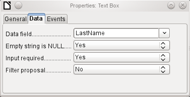
Empty string is NULL : Whether an empty string should be treated as (NULL) or the content simply deleted.
Entry required : This condition should match the one in the table. The GUI will prompt for entry if the user has not entered a value. [Model.InputRequired]
Filter proposal : When the data is to be filtered, the content of this field is temporarily stored as a suggestion. [Model.UserValueFilterProposal]
Caution – with large contents, this choice can use a lot of storage.
Changed : This event takes place when a control is modified and afterwards loses the focus. The event is lost if you switch directly to another record. In these circumstances, a change is saved without being detected previously. [com.sun.star.lang.EventObject]
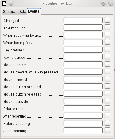
Text modified : Refers to the content, which can in fact be text, numeric, or whatever. Occurs after each additional character is entered. [com.sun.star.awt.TextEvent]
When receiving focus : The cursor enters the field.
Under no circumstances must the macro create a message dialog on the screen; clicking in such a dialog causes the form field to lose the focus and then recover it, triggering the macro again. A loop is created which can only be broken by using the keyboard.
When losing focus : The cursor leaves the field. This can lead to the same kind of interplay when the handling of the event causes it to recur.
Key : Refers to the keyboard. For example, a key is typed when you move through the form using the Tab key. This causes a field to receive the focus. Then the key is released.
The event is passed using the keyCode or KeyChar of the released key (letter, number, special key). [com.sun.star.awt.KeyEvent]
Mouse : Self-explanatory; these events only take place if the mouse is or was already within the field ("outside" corresponds to the javascript onMouseOut). [com.sun.star.awt.MouseEvent]
Reset : The form is emptied of all data (when creating a new record) or set back to its original state (when editing an existing record). For a form field, this event is triggered only when data entry is undone using the button in the navigation bar. [com.sun.star.lang.EventObject] When a form is first loaded, the two events Prior to reset and After resetting occur in succession, before the form is available for input.
Updating : If the event is bound to a form control, update takes place when the focus is lost and jumps to another form control, after altering the content of the field. Changes in the form are accepted and displayed. When a form is closed, the two events Before updating and After updating occur in succession. [com.sun.star.lang.EventObject]
As well as the properties set out on page 11, text fields can have the following additional properties:

When this value is 0, entry is not permitted. Usually the length of the database field to which the text field corresponds is used here.
[MaxTextLen]

Should default text be put into an empty field? This text must be deleted if any other entry is to be made successfully.
[DefaultText]

Possible types: Single-line | Multi-line | Multi-line with formatting (the last two differ in tabbing behavior and, in addition, a pattern field can not be bound to a database). The vertical alignment is not active for multi-line fields.
[MultiLine]

Unix or Windows? This mainly affects line endings. Internally Windows lines end with two control characters (CR and LF).
[LineEndFormat]

Only for multi-line fields: Horizontal | Vertical | Both.
[HScroll], [VScroll]

Active only for single-line fields. Changes characters to see only points.
[EchoChar]
Nothing of significance.
Nothing of significance.
In addition to properties already described, the following properties exist:

Minimum value for the field. Should agree with the minimum value defined in the table.
[ValueMin]


Scrolling increment when using the mouse wheel or within a spin box.
[ValueStep]

Value displayed when a new record is being created.
[DefaultValue]

Number of decimal places, set to 0 for integers.
[DecimalAccuracy]

Separator for thousands, usually a comma.
[ShowThousandsSeparator]
There is no check on whether a field can be NULL. If there is no entry, the field will be NULL and not 0.
No filter proposal is offered.
The Changed event is absent. Changes must be handled using the Text modified event (the word text is not to be taken literally here).
As well as the properties described on page 1, the following are to be noted.

Minimum value for the field, selectable using a drop-down calendar.
[DateMin]


Short form as 10.02.12 or various forms using '/' instead of '.' or '-' in the American style.
[DateFormat]

Here you can enter a literal date but unfortunately not (yet) the current date (Today) at the time the form is opened.
[DefaultDate]

A month calendar for selecting dates can be included.
[DropDown]
There is no check on whether a field can be NULL. If there is no entry, the field will be NULL and not 0. No filter proposal is offered.
The Changed event is absent. Changes must be handled using the Text modified event (the word text is not to be taken literally here).
As well as the properties listed on page 1, the following features are available.

Minimum value for the field, by default set to 0.
[TimeMin]

Maximum value, by default set to 1 second before 24:00.
[TimeMax]

Short form without seconds, long form with seconds, and also 12-hour formats with AM and PM.
[TimeFormat]

You can set a fixed time but unfortunately not (yet) the actual time of saving the form.
[DefaultTime]
There is no check on whether a field can be NULL. If there is no entry, the field will be NULL and not 0.
No filter proposal is offered.
The Changed event is absent. Changes must be handled using the Text modified event (the word text is not to be taken literally here).
In addition to the properties already listed on page 1, the following features are available:
Min. value, Max. value, Increment, Default value, Decimal places, and Thousands separator. correspond to the general properties listed on page 1. In addition to these, there is only:

The symbol is displayed but not stored in the table that underlies the form.
[CurrencySymbol]

Should the symbol be placed before or after the number?
[PrependCurrencySymbol]
There is no check on whether a field can be NULL. If there is no entry, the field will be NULL and not 0.
No filter proposal is offered.
The Changed event is absent. Changes must be handled using the Text modified event (the word text is not to be taken literally here).
In addition to the properties listed on page 1, the following features are offered:
Minimum and maximum values, and the default value, depend on the formatting. Behind the button for Formatting is a flexible field that makes most currency and numeric fields unnecessary. Unlike a simple currency field, a pattern field can show negative sums in red.

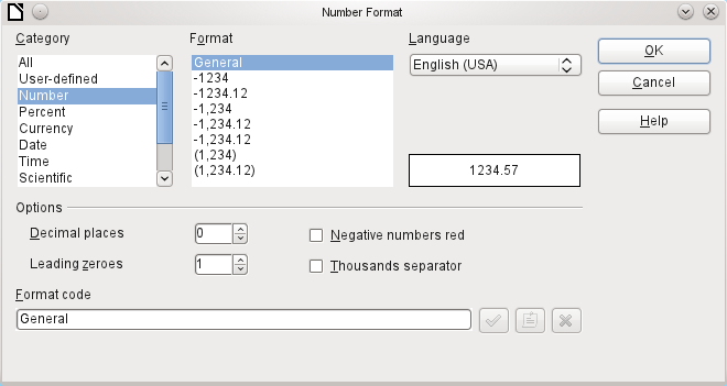
The button to the right with the three dots provides a choice of numeric formats, as you usually do in Calc.
[FormatKey]
Among the numeric formats can be seen, alongside Date, Time, Currency or normal numeric format, possibilities for using fields with a measurement unit such as kg (see Figure 6). See also the general Help on numeric format codes.
A formatted field makes it possible to create and write into timestamp fields in tables using just one field. The Form Wizard uses a combination of a date and a time field for this.
If you want to enter data in the form minutes:seconds:hundredths of seconds into a timestamp field, you will need to use macros.
Figure 6: Formatted field with general numeric options
Nothing special to report.
The Changed event is absent. Changes must be handled using the Text modified event (the word text is not to be taken literally here).List box
When a list box is created, the List Box Wizard appears by default. This automatic appearance can be switched off if required using the Wizards On/Off button (shown in Figure 1).
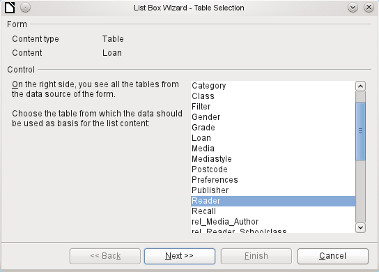
The form is already defined. It is bound to a table named Loans. A list box shows the user different data from what is actually transmitted into the table. This data usually comes from another table in the database, and not from the table to which the form is bound.
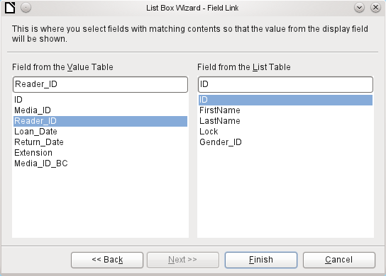
The Loans table is supposed to show which Reader has borrowed which Media. However this table does not store the name of the reader but the corresponding primary key from the Reader table. It is therefore the Reader table that forms the basis for the list box.
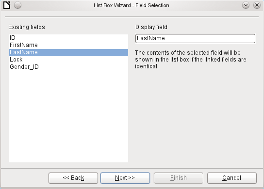
The LastName field from the Reader table should be visible in the list box. This serves as the Display field.
The Reader_ID field occurs in the Loan table which underlies the form. This table is described here as the Value table. The primary key ID from the Reader table must be bound to this field. The Reader table is described here as the List table.
The list box has now been created complete with data and default configuration and is fully functional.
In addition to the properties listed on page 1, the following features are available.

The list entries have already been set using the Wizard. Here you could add further entries that are not from any table in the database. List entries here mean the visible entries, not those that the form will transmit to the table.
[StringItemList]

If the field is not specified as drop-down, scroll arrows will appear on the right side of the list box when the form is loaded. The list field then automatically becomes a multi-line field, in which the actual value selected is highlighted.
[Dropdown]

If the field is drop-down, this property gives the maximum visible number of lines. If the content extends over more lines, a scrollbar appears when the list drops down.
[LineCount]

Can more than one value be selected? In the above example, this is not possible since a foreign key is being stored. Usually this function is not used for databases, since each field should only contain one value. If necessary, macros can help in the interpretation of multiple entries in the list field.
[MultiSelection] [MultiSelectionSimpleMode]

As the deactivated button makes clear, a default selection makes little sense in the context of a binding with a database table, as created by the List Field Wizard. It could well be the case that the record corresponding to the default selection in the example table Readers is no longer present.
[DefaultSelection]
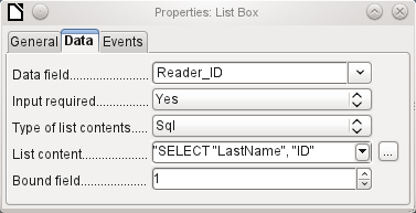
In addition to the usual data properties, Data field and Input required, there are significant properties which affect the binding between the displayed data and the data to be entered into the table that underlies the form.
Type of list contents : Valuelist | Table | Query | SQL | SQL [Native] | Tablefields [ListSourceType]
List contents Valuelist : If list entries have been created under General , the corresponding values to be stored are entered here. The list contents are loaded with individual items separated by Shift+Enter . The List content field then shows them as "Value1";"Value2";"Value3" … The Bound Field property is inactive.
List contents Table : Here one of the database tables can be selected. However this is seldom possible as it requires the content of the table to be so structured that the first table field contains the values to be displayed in the list field, and one of the following fields contains the primary key which the table underlying the form uses as a foreign key. The position of this field within the table is specified in Bound Field, where the Numbering begins with 0 for the first field of the database table . But this 0 is reserved for the displayed value, in the above example the Surname, while the 1 refers to the ID field.
List contents Query : Here a query is first created separately and stored. The creation of such queries is described in Chapter 5, Queries. Using the query, it is possible to move the ID field from the first position in the underlying table to the second position, here represented by the bound field 1.
List contents SQL : The List Box Wizard fills this field. The query constructed by the Wizard looks like this:
The query is the simplest possible. The Surname field occurs at position 0, the ID field at position 1. Both are read from the Reader table. As the bound field is Field 1, this SQL formula works. Here should be added ORDER BY "LastName" ASC. So you don't need to scroll too long through the list to find somebody. An additional problem might be that LastName could be the same for more than one reader. So FirstName must be added in the view of the list box. When there are readers with the same LastName and the same FirstName, the primary key ID must also be shown. See Chapter 5, Queries, for information on how this works.
List contents SQL [Native] : The SQL formula is entered directly, not using the Wizard. Base does not evaluate the query. This is suitable when the query contains functions that might perhaps not be understood by the Base GUI. In this case the query is not checked for errors. More about direct SQL Mode can be found in Chapter 5, Queries.
List contents tablefields: Here Field names from a table are listed, not their content. For the Reader table, the List contents would be ID, Given name, Surname, Lock, Gender_ID.
If you want a time field that can handle time in milliseconds, you will need a timestamp field, as described in the section on “Time field”. The representation of milliseconds is incompatible with the way characters are assembled in list boxes. To get around this, you must convert the timestamp into text:
SELECT REPLACE(LEFT(RIGHT(CONVERT(”Required_service(??)”.
”Time”, VARCHAR),15),8),’.’,’,’) AS “Listcontent”, “ID” FROM “Required_service”
This will give a display in minutes:seconds:hundredths.
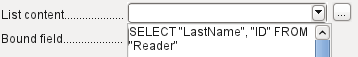
Bound field : List fields show content that is not necessarily identical to what will be stored in the form. Usually a name or something similar is displayed and the corresponding primary key becomes the stored value of this field.
SELECT "Name", "ID" FROM "Table" ORDER BY "Name"
The ID field is stored in the underlying table as a foreign key, The field count in databases begins at zero so the field bound to it in the form has the number 1.
If instead you select “0”, then the content of the Name field is saved inside the form. In that case you can remove the ID field from the query.
It is even possible to choose the position “–1”. Then it is not the content of the query but the position of the entry that is stored in the list. The first record then has the position 1.
The above query yields the following result: